
CONCEPT & ARTWORK
HOLIDAY 2020 & 2021
What began as a simple request for a holiday monogram concept quickly grew into one of the Home division’s most successful gifting programs. The goal was clear: create something beautiful and personal that would spark joy during the holidays, something that felt like a small discovery and a thoughtful gesture, all in one.
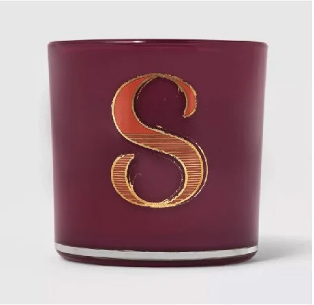
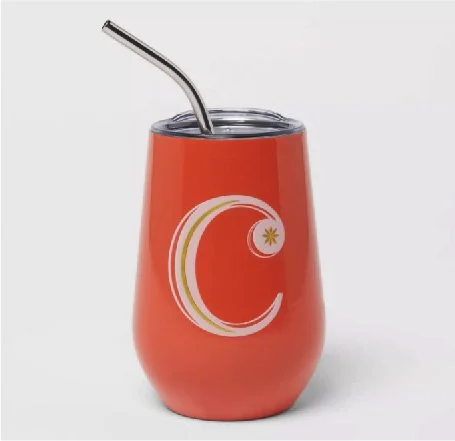
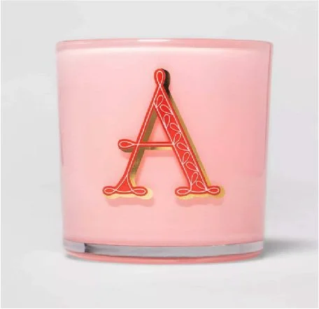
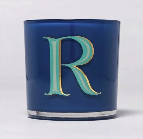
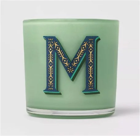
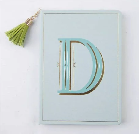
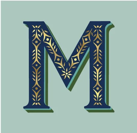
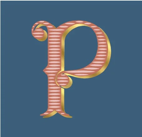
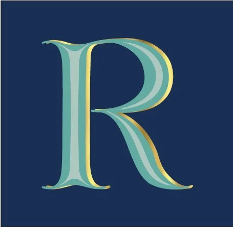
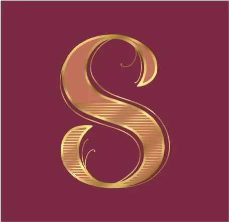
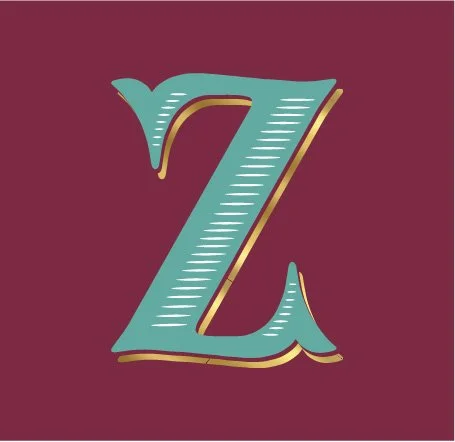
To achieve this, I immersed myself in research, collecting hundreds of lettering references, ranging from ornate historical alphabets to expressive modern scripts. I wanted each monogram to feel timeless yet fresh, with character and charm that reflected both heritage and contemporary design sensibilities. The final 2020 assortment included 12 hand-lettered monograms, each uniquely crafted and applied to gifting items such as candle vessels, journals, and hydration bottles. The response was immediate and enthusiastic, with guests praising the collection in glowing online reviews.
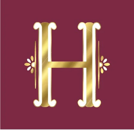
Encouraged by its success, we expanded the program in 2021 to include all 26 letters and updated color palettes. The collection not only struck an emotional chord with guests but also delivered exceptional business results, ultimately becoming the most profitable gifting statement in the Home category, with over $30 million in combined sales.


TIME LAPSE VIDEO ON PROCREATE
This time-lapse shows the early sketch phase of a monogram program I developed. It captures the evolution from rough ideas to more refined letterform concepts, as I explored style, composition, and balance.

The goal was to create a versatile system that felt personal and elevated—something that could scale across product types while maintaining a strong visual identity.
THE FINAL PRODUCT
The finalized monograms were applied across a range of products, including candles, hydration bottles, and notebooks. Each application was thoughtfully considered to suit the material and format.